Accessibility 101
Some accessibility practices that you should always keep in mind when building websites.

Photo by Elizabeth Woolner on Unsplash
Accessibility
Accessibility, also known as A11y, allows websites to be used by everyone. Yes, everyone, not just the disabled. For example, an individual using their mobile device in the sun would also need an accessible website, the same as someone whose abilities are changing due to ageing. Accessibility allows us to build an inclusive web that works for everyone. Without further ado, let's discuss some accessibility practices that we should always keep in mind when building websites that work for everyone.
Colour Contrast
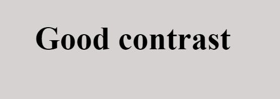
Sufficient colour contrast between text and background is important. A good text to background colour contrast ratio allows easy reading of the content of a web page. People with poor eyesight, colour blindness and other eye defects would find it difficult to distinguish between the text and the background of a web page with poor colour contrast. To ensure good contrast, you should follow the WCAG AA guidelines which specify a minimum contrast ratio of 3:1 for large text and 4.5:1 for smaller text.


To compare colour contrast, you can use WebAIM's contrast checker and Wave, a browser extension used for checking a website's accessibility.
Links
Links shouldn't be left empty as this makes it difficult for screen readers to understand. When a screen reader goes to that link, it doesn't say anything. For instance, if you have a link or button with a font icon, but without a text, you can fix the link or button by adding a hidden span indicating what it is, changing the icon to an SVG with a title or changing the icon to an image with alt text.
❌
    <a href="#">
        <i class="fa fa-search"></i>
    </a>
✅
<!-- visually hidden -->
    <a href="#">
        <span class="hidden_span">search for recipes</span>
        <i class="fa fa-search"></i>
    </a>

<!-- SVG with title -->
    <a href="#">
        <svg version="1.1" id="Capa_1" xmlns="http://www.w3.org/2000/svg" xmlns:xlink="http://www.w3.org/1999/xlink" x="0px" y="0px" viewBox="0 0 490 490" style="enable-background:new 0 0 490 490;" xml:space="preserve">
            <title>Search for recipes</title>
            <path d="M437.588,202.053C437.588,90.634,344.307,0,229.643,0S21.683,90.634,21.683,202.053s93.296,202.068,207.96,202.068 c43.421,0,83.744-13.04,117.128-35.243L456.982,490l11.335-10.318L359.242,359.809C406.918,322.749,437.588,265.857,437.588,202.053 z M229.643,388.809c-106.23,0-192.647-83.785-192.647-186.756S123.412,15.313,229.643,15.313c106.216,0,192.633,83.77,192.633,186.741S335.858,388.809,229.643,388.809z"/><g></g><g></g><g></g><g></g><g></g><g></g><g></g><g></g><g></g><g></g><g></g><g></g><g></g><g></g><g></g>
        </svg>
    </a>

<!-- Image with alt -->
    <button>
       <img src="search.svg" alt="Search for recipes">
    </button>
Labels
A label is an important part of a form, it makes screen reading easy. A lot of people think a placeholder can replace a label, no, a placeholder is only meant to give exemplary data for the input. Here are some ways of labelling your input:
❌
<!--- no label --->
<input id="name" name="name" type="text" />
✅
<label for="name">Name</label>
<input id="name" name="name" type="text" />
✅
<label>
  Name:
  <input name="name" type="text" />
</label>
✅
<!-- visually hidden label -->
<label for="name" class="hidden_label">Name</label>
<input id="name" name="name" type="text" />
Focus state
The Focus state shows the currently focused element and it is a requirement for a site to be considered accessible under the Web Content Accessibility Guidelines (WCAG). However, most developers have at one point or the other used :focus{outline:none} to remove focus from an element, this is a bad accessibility practice. To meet accessibility requirements, we can replace the default outline with our own focus indicator e.g adding a border styling on focus.
❌
:focus{
outline:none;
}
✅
:focus{
outline: none;
border: 2px solid black;
}
Alt Text
According to the WCAG guideline, all non-text content that is presented to the user should have a text alternative that serves the equivalent purpose. An alt text is an invisible text describing an image, it makes images on a website accessible to individuals with visual impairment using a screen reader and users who can't load the image due to slow internet or user setting. Images without alt text only get read as 'image' by the screen reader, this is why an alt text should be accurate and concise in describing an image.

❌
<img src="cat.png" alt="A cat" />
✅
<img src="cat.png" alt="A brown cat laying on a rug" />
Headings
Headings are a way of structuring web content, they aren't just to display text based on size, they're important for accessibility too. They allow screen readers and other assistive technology users to skip from heading to heading. A webpage should only contain one h1 tag, don't use headings where they're not needed e.g to emphasize or highlight text, instead, use CSS classes and don't skip headings e.g from <h2> to <h4>.
Ambiguous links
Link text such as 'read more', 'click here', 'more', etc can be ambiguous when read out of context by screen readers. You can fix this by using a more informative text.
❌
<a src="files.html">Click here</a> to view all files.
✅
<a src="files.html">View all files</a>
Conclusion
Implementing accessibility practices allows for websites to be used by all without any hassle. There are a lot of accessibility practices, but we can't go through them all in this article. However, I hope you were able to learn one or two accessibility tips from this post. You can read more on accessibility practices from WebAIM website and Lindsey's website. Make sure to download WAVE browser extension to evaluate the accessibility of your websites. Thank you for reading ✌️.